The Psychology of Typography
The choice between upper case and lower case letters plays a crucial role in readability and perception:- Lower case text is more effective for quick recognition. The human brain recognises words as shapes, making lower case text easier to process at a glance. This is why road signs and fast-paced advertising often use lower case for clarity and speed.
- Upper case fonts convey authority and urgency, making them ideal for warning or instructive signage. However, excessive use of capital letters can appear aggressive or difficult to read in longer messages.
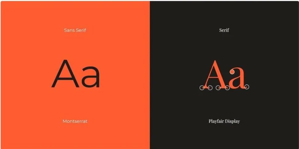
Serif vs. Sans Serif: Which is Better?
A serif is the small decorative stroke at the end of a letter. Serif fonts have a classic, sophisticated look and help guide the eye from one letter to the next, making them great for printed materials. On the other hand, sans serif fonts (meaning "without serifs") are clean, modern, and highly readable, making them a popular choice for signage, particularly for digital displays and large-format prints. For maximum impact, a good rule of thumb is to use a sans serif font for headlines and a serif font for body text, ensuring a balance of style and legibility.Size, Spacing, and Readability
- Font Size: A sign must be legible from a distance. Car number plates, for instance, use 79mm-high text for long-range visibility. This principle applies to signage—text must be large enough to read quickly.
- Letter Spacing (Kerning): Overly condensed letters can make reading difficult, while well-spaced text enhances clarity.
- White Space: Avoid clutter. A clean perimeter around text improves readability and keeps signage looking professional.
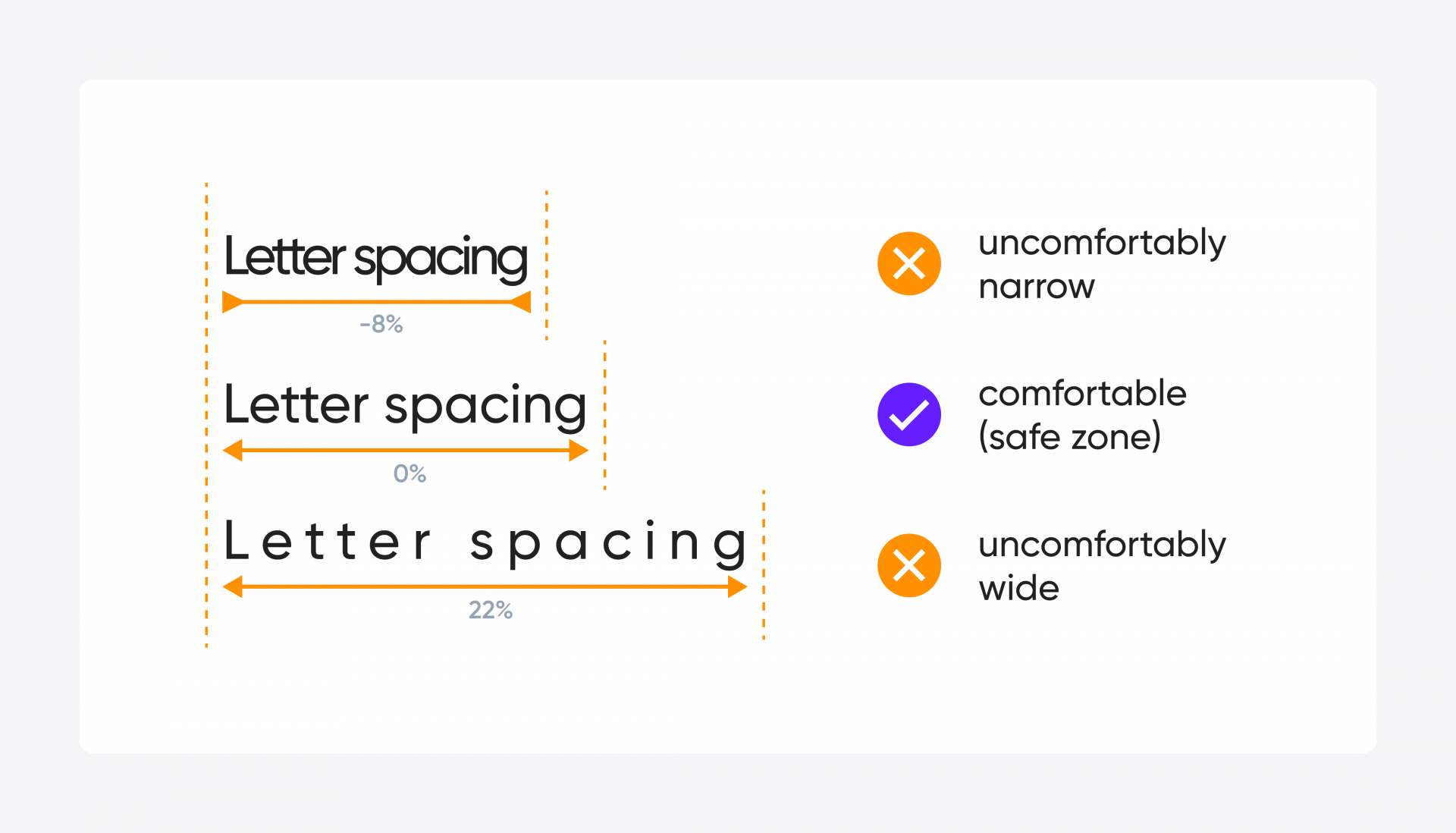
Letter spacing guidelines from Cieden
Less is More: Font Selection and Consistency
With so many fonts available, it can be tempting to use multiple styles. However, sticking to a maximum of two or three fonts creates a cohesive and professional look. Additionally, branding should remain consistent—use fonts that align with your business’s existing design elements, from websites to business cards and external signage.The Top 10 Fonts for Signage
Here are ten fonts that are widely used and respected for signage and print:- Playfair Display – A modern serif with a stylish, sophisticated look.
- Adobe Garamond Pro – A timeless, classic serif font.
- Gotham – A geometric sans-serif known for its versatility.
- Poppins – A contemporary sans-serif ideal for digital and print.
- Times New Roman – A well-established serif with strong readability.
- Century Gothic – A clean and modern sans-serif.
- Trajan Pro – An elegant, authoritative all-capitals serif font.
- Sylfaen – A multi-script serif known for its clarity.
- Futura – A sleek, rounded sans-serif, favoured for its versatility.
- Helvetica Neue – A refined version of the classic Helvetica, widely used for signage.