Parasols are viewed from a distance, above crowds, and from multiple angles at once. What looks detailed and polished on a screen can quickly become unreadable outdoors especially in bright light or busy environments.
That’s why parasol design needs a different mindset: distance-first, not detail-first.
If you’re planning parasols for events, hospitality or activations, it’s worth getting the design right early. A well-designed parasol doesn’t just look good — it improves visibility, attracts attention and reinforces your brand from across the space.
If you’re planning parasols for events and activations, you might also like our guide Branded Parasols for Outdoor Events: A Practical Guide.
Start with the 20-metre rule
When designing artwork for parasols, one principle matters more than anything else: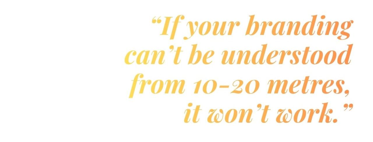
That’s why parasols should be treated like signage — not packaging.
You’re not designing for someone holding a product in their hands. You’re designing for someone walking past, across a crowd, in bright daylight.
A simple checklist to get started:
- One clear logo
- One supporting line (max) — keep messaging minimal
- Strong contrast — ensure strong separation between elements
- Bold, simple shapes and forms — avoid fine detail that disappears at distance
Where should your branding go?
One of the most important design decisions is where your branding sits on the parasol. Placement affects how your logo is seen, how often it’s noticed, and how it performs in different environments.The two main areas to consider are the canopy panels and the valance — and each serves a different purpose.
Canopy (top panels)
The canopy is the most visible part of the parasol from a distance. It's best used for:
- Catching attention across a busy space
- Helping people spot your stand from afar
- Drone shots, photography and wide-angle views
- Creating a strong “landmark” presence
Valance (the edge of the edge)
The valance is the strip of fabric that runs around the edge of the parasol. The valance sits at eye level, so it’s where people actually read your branding. It works well for::
- People walking past
- Queues or seating areas
- Hospitality environments like cafés, terraces and beer gardens
- Reinforcing your brand once someone is nearby
In most setups:
- a bold logo on the canopy
- a clean repeat of your branding on the valance
A simple layout that works (almost every time)
Most strong parasol designs follow a very simple structure:- Logo (main focus)
- Short supporting line (optional)
- Clean background
Where designs usually go wrong:
- trying to include too many messages
- adding extra graphics just because there’s space
- filling every panel
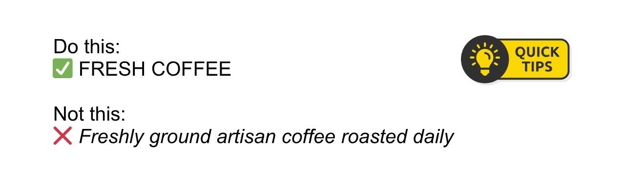
Typography: keep it clear and easy to read
Typography can make or break your parasol design.What looks elegant on a screen can quickly become unreadable in real-world conditions — especially in bright light, at distance, or when viewed at an angle.
The key is to prioritise clarity over style.
What works best
- Bold, simple sans serif fonts - clean and easy to read from a distance
- Short wording - quick to scan and understand
- Enough spacing between letters - improves readability, especially on curved panels
- Thin or narrow fonts that disappear in sunlight
- Long phrases that wrap awkwardly across panels
- Overly decorative or script fonts
- Tight letter spacing that reduces clarity
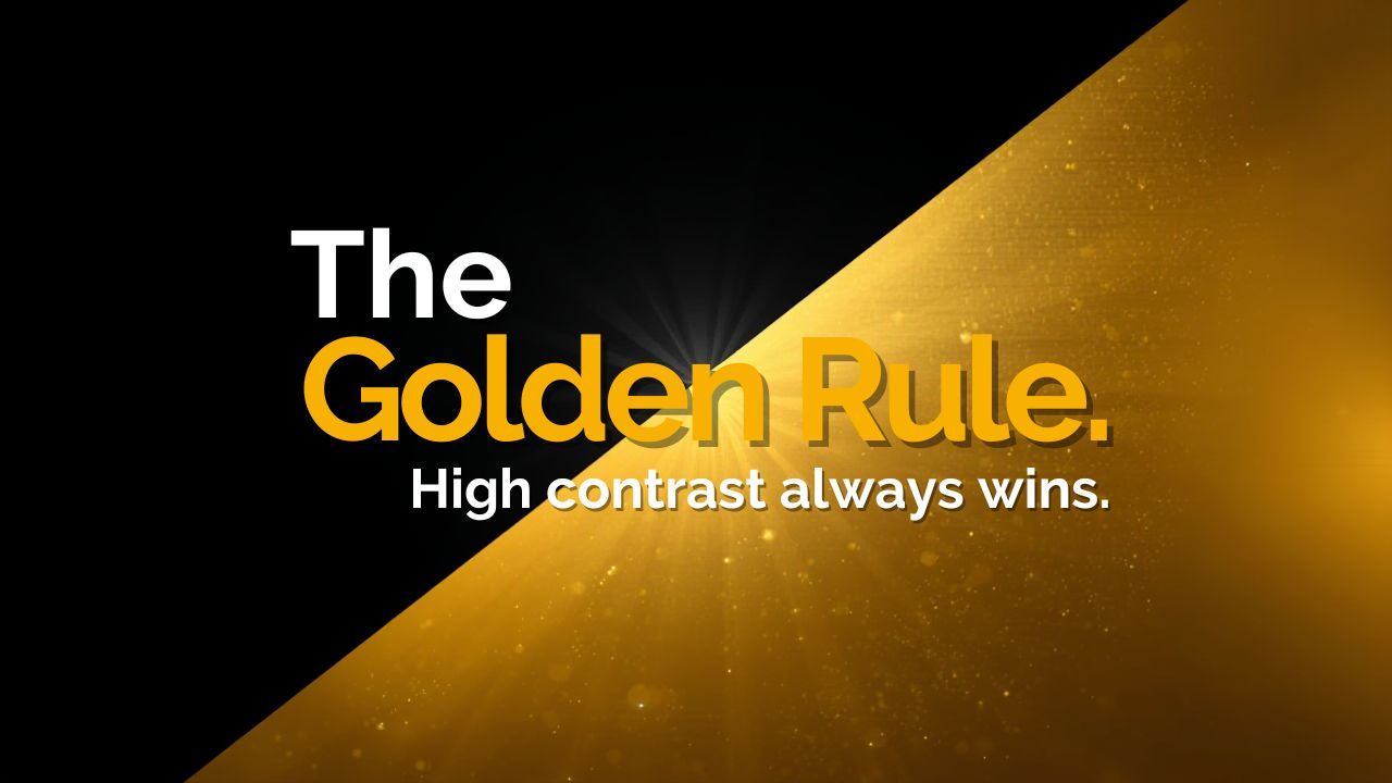
Colour and contrast: the biggest make-or-break factor
If there’s one reason parasol designs fall flat, it’s this: not enough contrast.What looks subtle and “premium” on a screen often becomes hard to read outdoors. Sunlight, glare and distance all reduce clarity — so your design needs to work a bit harder.
- Dark logo on a light background
- Light logo on a dark background
- Bold, clearly separated colours
What to avoid
- Tone-on-tone colours (e.g. navy on blue)
- Pale colours on white backgrounds
- Mid-tone colours layered together
Why it matters
At events, people aren’t studying your design — they’re walking past and making quick decisions.
Strong contrast helps your branding stand out instantly, even in bright light or crowded spaces.
Pro tip: test in greyscale
Before finalising your artwork, try viewing it in black and white.
- if the logo still stands out clearly → you’re in a good place
- if everything blends together → increase the contrast
Designing for every angle (not just the “front”)
Parasols aren’t viewed from a single direction.People will see them:
- from all sides
- while moving past
- from below
- logos should be repeated across multiple panels
- the layout should stay consistent
- there shouldn’t be a single “main side”
Patterns and backgrounds: how to elevate the design
If you want the parasol to feel more premium without adding clutter:What works:
- subtle repeating patterns
- light textures
- small brand elements used sparingly
- photo backgrounds
- busy graphics
- anything that competes with the logo
Matching the design to the environment
One thing that’s often overlooked is where the parasol will actually be used.For example: Busy festivals or outdoor events
- stronger contrast
- simpler layouts
- larger logos
- slightly more refined
- balanced canopy and valance branding
- softer colours (but still readable)
- more minimal
- consistent spacing
- subtle detailing
Common design mistakes to avoid
Before finalising your artwork, watch out for these common pitfalls:- too much text
- low contrast colours
- logos that are too small
- overly detailed crests or graphics
- only branding one panel
- mixing too many styles or colours
Getting your artwork right first time
Most parasol artwork issues come down to the same few things: too much detail, not enough contrast, or not thinking about how it will actually look outdoors.If you keep things simple, prioritise readability, and design with distance in mind, you’ll avoid most of the common pitfalls.
If you’re ready to move forward, you can explore our range of printed parasols to see the formats and layouts available.
And if you’re still planning your wider setup, our guide to branded parasols for outdoor events covers how to use them effectively in real event spaces.