That’s why parasol design needs a different mindset: distance-first, not detail-first.
If you’re planning parasols for events, hospitality or activations, it’s worth getting the design right early. A well-designed parasol doesn’t just look good — it improves visibility, attracts attention and reinforces your brand from across the space.
If you’re planning parasols for events and activations, you might also like our guide Branded Parasols for Outdoor Events: A Practical Guide.
The 20-metre rule
When designing artwork for parasols, one principle matters more than anything else: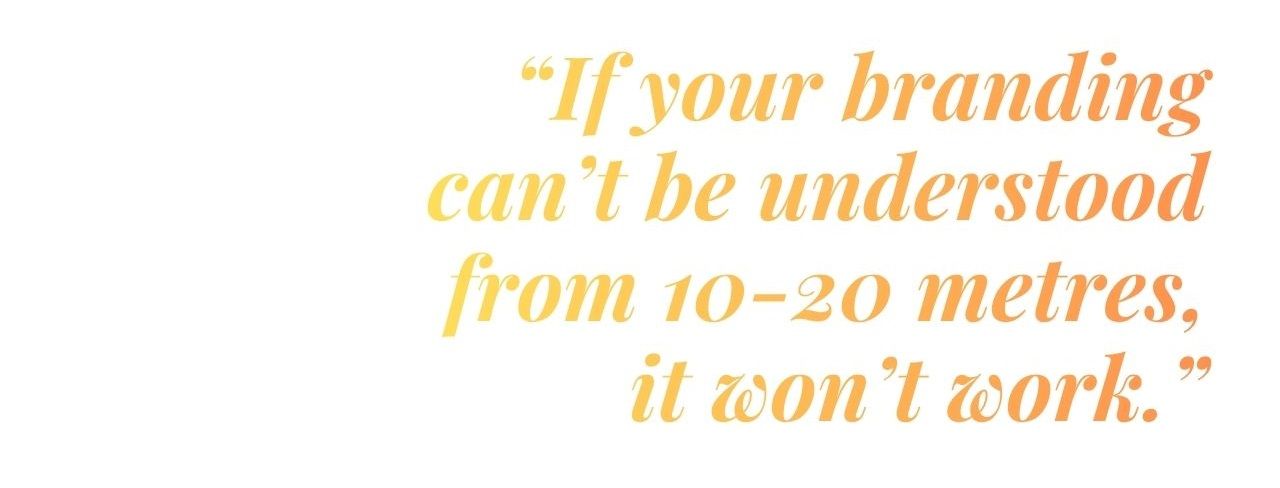
That’s why parasols should be treated like signage — not packaging.
You’re not designing for someone holding a product in their hands. You’re designing for someone walking past, across a crowd, in bright daylight.
A simple checklist for distance clarity:
- One logo — clear and dominant
- One supporting line (max) — keep messaging minimal
- High contrast — ensure strong separation between elements
- Bold shapes and forms — avoid fine detail that disappears at distance
Placement guide: canopy vs valance (where should the branding go?)
One of the most important design decisions is where your branding sits on the parasol. Placement affects how your logo is seen, how often it’s noticed, and how it performs in different environments.The two main areas to consider are the canopy panels and the valance — and each serves a different purpose.
Canopy panels (top surface)
The canopy is the most visible part of the parasol from a distance. Best for:
- Long-range visibility across open spaces
- Standing out in busy crowds or large events
- Drone shots, photography and wide-angle views
- Creating a strong “landmark” presence
Valance (the hanging edge)
The valance is the strip of fabric that runs around the edge of the parasol. Best for:
- Eye-level visibility as people walk past
- Close-range readability
- Hospitality environments like cafés, terraces and beer gardens
- Reinforcing branding in seated areas
What looks most premium?
The most polished designs use both areas strategically, rather than choosing one over the other.
- Canopy: bold, minimal logo placement for maximum impact
- Valance: clean, repeated branding around the edge for consistency
A common mistake is overloading both areas with too much information. The premium approach is restraint: clear branding, generous spacing, and consistency across every panel.
When done well, the parasol feels less like a printed product and more like a considered extension of your brand environment.
The layout formula for premium-looking parasols (the “3-part blueprint”)
If you want your parasol to look polished and high-end, simplicity is your strongest tool.A good rule to follow is this 3-part blueprint — used across many premium outdoor and hospitality brands:
- Primary element: your logo
This is the focal point.- Keep it large, clear and easy to recognise
- Position it so it’s visible across multiple panels
- Avoid shrinking it to make space for other elements
- Secondary element: a short supporting line (optional)
This could be:- A short strapline
- A URL or social handle
- Background: solid colour or subtle pattern
The background sets the tone of the design.- Solid brand colours create strong contrast and clarity
- Subtle patterns can elevate the look when used carefully
Why this works
As soon as you go beyond these three elements, designs tend to become cluttered and harder to read especially at distance.
Premium parasol design isn’t about adding more. It’s about removing anything that doesn’t need to be there.
Negative space plays a big role here. Giving your logo room to breathe instantly makes the design feel more confident, more considered, and ultimately more high-end.
Typography: fonts that stay readable outdoors
Typography can make or break your parasol design.What looks elegant on a screen can quickly become unreadable in real-world conditions — especially in bright light, at distance, or when viewed at an angle.
The key is to prioritise clarity over style.
What works best
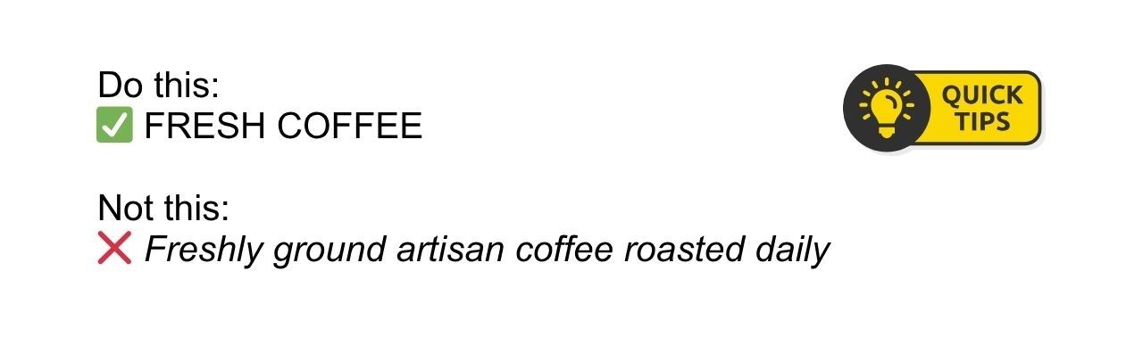
- Bold, simple sans serif fonts — clean and easy to read from a distance
- Short, direct wording — quick to scan and understand
- Well-spaced lettering — improves readability, especially on curved panels
- Thin or narrow fonts that disappear in sunlight
- Long phrases that wrap awkwardly across panels
- Overly decorative or script fonts
- Tight letter spacing that reduces clarity
If someone can’t read your message instantly while walking past, it’s too complex.
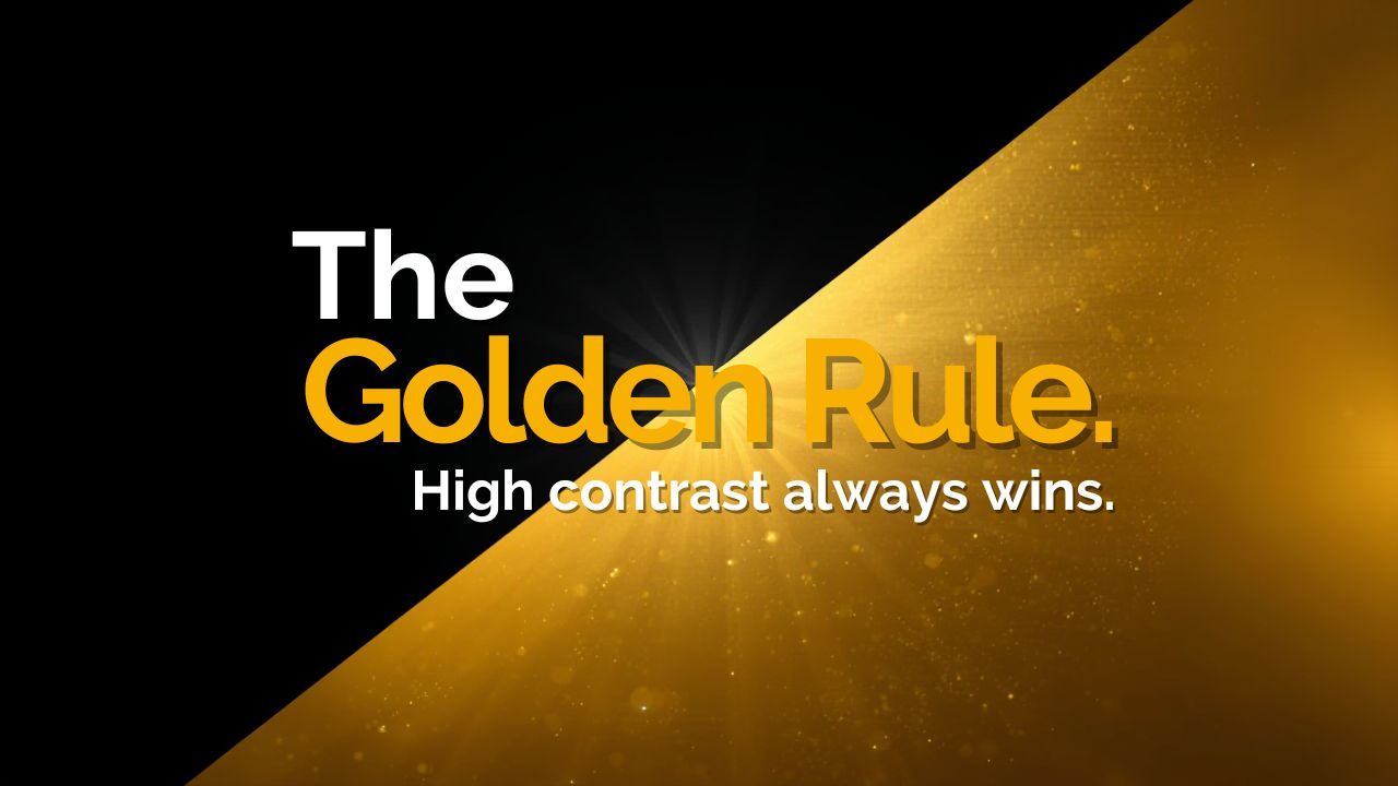
Colour + contrast rules (non-negotiables)
If there’s one reason parasol designs fail, it’s this: not enough contrast.What looks subtle and sophisticated on a screen often becomes flat and unreadable outdoors. Sunlight, glare and distance all reduce visibility — so your design needs to work harder.
- Dark logo on a light background
- Light logo on a dark background
- Bold, clearly separated colours
What to avoid
- Tone-on-tone colour palettes (e.g. navy on blue)
- Pale colours on white backgrounds
- Mid-tone colours layered together
Why it matters
At events, people don’t stop to analyse design. They scan quickly while walking past. Strong contrast allows your branding to cut through instantly, even in bright or crowded environments.
Pro tip: test in greyscale
Before finalising your artwork, convert it to black and white.
- If your logo still stands out clearly → you’re good
- If everything blends together → increase contrast
Panel strategy: how to get 360° branding (and not waste panels)
Unlike banners or posters, parasols are rarely viewed from just one direction.People approach from all angles, move around your space, and see your setup from different distances. That means your branding needs to work in every direction — not just one “front” view.
Design for full visibility
To maximise impact, your logo should be visible no matter where someone is standing.
- Repeat your logo across multiple panels so it can be seen from any angle
- Ensure consistent sizing and placement for a clean, professional look
- Distribute branding evenly around the canopy
Avoid the “hero panel” mistake
A common mistake is placing all the branding on just one panel.
The problem?
There’s no guarantee people will ever see it.
At busy events, foot traffic is unpredictable — and your parasol might be approached from any side. Relying on one “perfect angle” limits visibility and weakens impact.
Keep orientation consistent
As you repeat your logo across panels, consistency matters:
- Keep the logo facing the same direction on each panel
- Align positioning carefully so everything feels balanced
- Avoid rotating or flipping artwork inconsistently
Common design mistakes to avoid
Even strong brands can lose impact if the design isn’t adapted for outdoor use. Before finalising your artwork, watch out for these common pitfalls:- Too much text — messaging becomes hard to read at distance
- Low contrast — designs fade in bright light
- Tiny logos — lack of presence and visibility
- Overly detailed crests or graphics — fine elements get lost
- Key information on just one panel — limits visibility from other angles
- Mismatched colours — reduces clarity and brand consistency
Bring your design to life
A well-designed parasol doesn’t just look good; it works hard in real environments, attracting attention and reinforcing your brand from every angle.When you’re ready to put your design into action, explore our range of printed parasols — ideal for events, pop-ups and outdoor hospitality.
If you’re planning how to use them in real-world setups, you might also find our guide to branded parasols for outdoor events helpful.